Gleaning Design
The visual direction of The Ruqah Project is a new one to construct for me: I haven’t worked on a type design project that directly derives its aesthetic from a specific source before.
My MATD project was nothing but an exercise in learning how to construct letters. As soon as I reached something that looked like a typographic ‘d’, for example, after a lot of copying and pasting and rotating, I was more or less done with that letter — save for applying few attributes to achieve at least some stylistic cohesion. The rest of the typeface design projects I’ve worked on as a freelancer had had their creative directions pre-determined, and I was only involved in expanding the character set and developing them into working fonts.
When I started to conceptualize TRP, it was the first time I had visualized the look and feel of a typeface, however abstract, before going into drawing it. What initially inspired me and overtime crystallized my vision was the presence of a lush variety of source materials, namely, movie posters from Egypt of a few decades ago. At first I spent a lot of time objectively scrolling through a slideshow of images. I only observed and started again from the beginning. Then I started to spot certain things I liked; graphic attributes that thematically blended in began to stand out in detail.
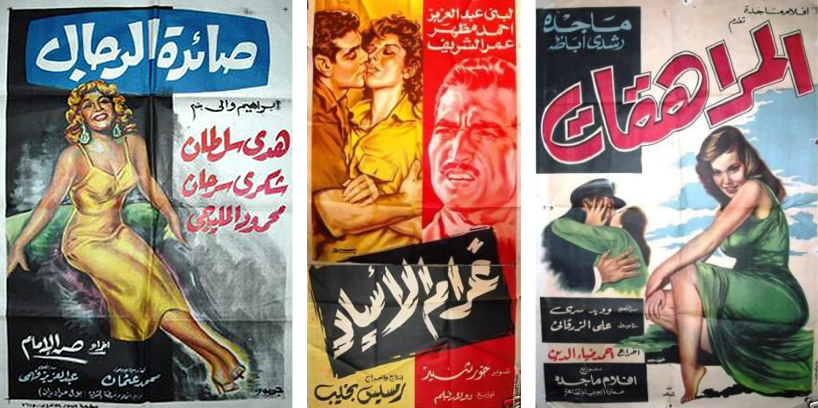
Examples of posters that took part in the initial slideshow. Images via Ebay.
I highlighted these images and started to try calligraphically emulating their forms. At times I was unostentatious, sticking to a clear derivation of what I saw; other times I was getting ahead of myself, trying new things and modifying the calligraphic forms.
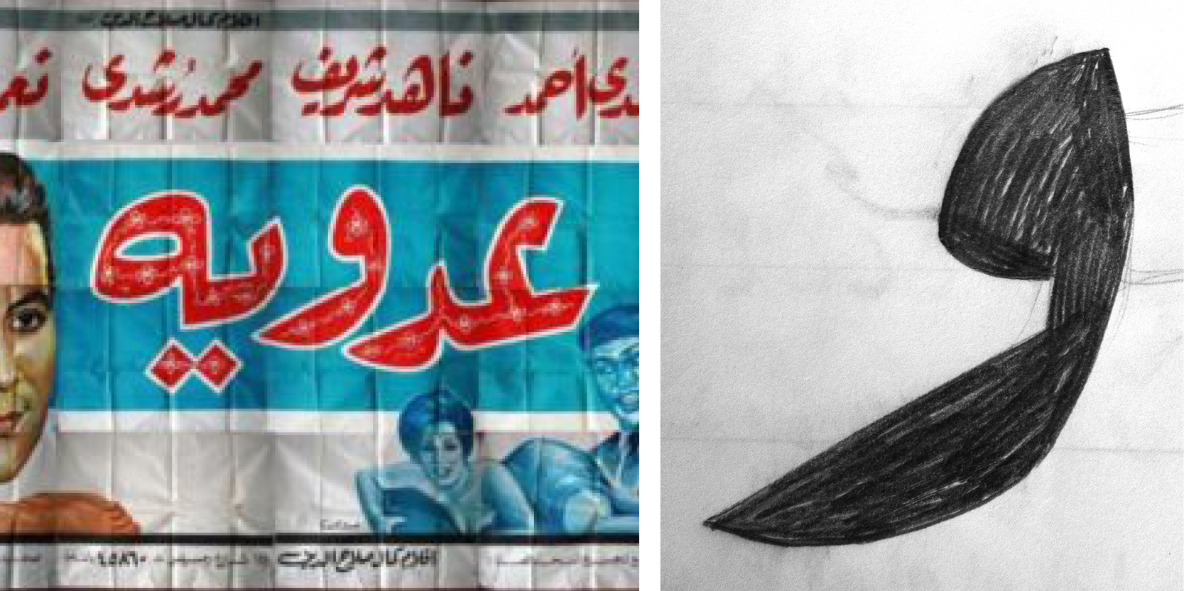
An example of stylistic deviation as told through a waw. Poster image via Ebay.
At the same time, I started to think about what Latin letterforms could look like if they shared the same or similar typographic attributes. This is a particularly involved topic to ponder; it touches on typographic matchmaking and the ever-sensitive subject of harmonizing different scripts to bring them under a single stylistic umbrella. I of course wanted to go about this in the most respectful and unobjectionable way possible, which is why I started to design Arabic letterforms before I did Latin ones, for instance. I wanted to make sure I wasn’t forcing any ‘Latin’ onto the Arabic; I felt alright about going the other way around. I will address this in a more involved later post, but it’s worth mentioning because this consideration was present at the onset of the project.
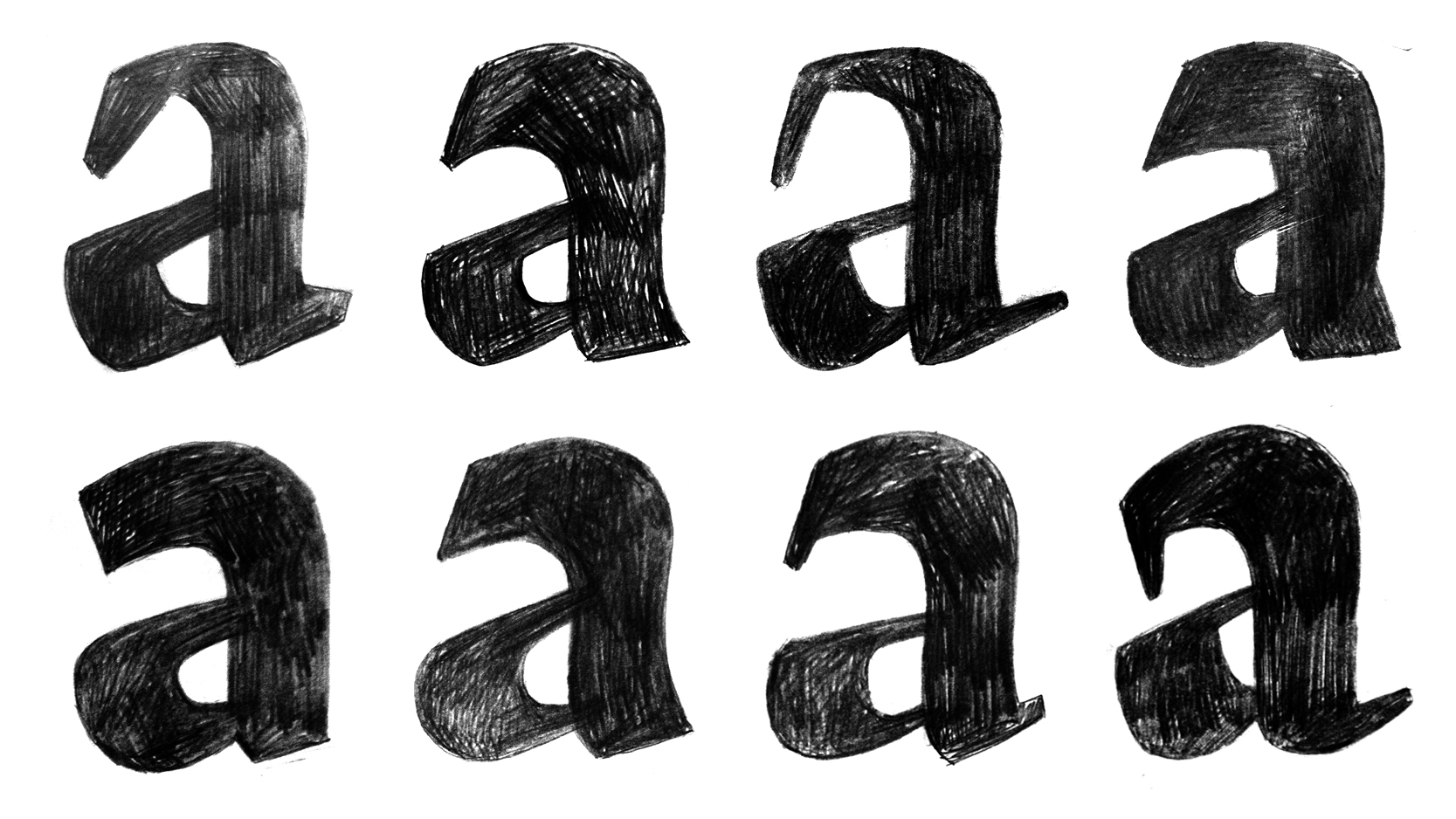
An exploration of quirks and attributes on Latin.
After a lot of sketching during which I tried to harmonize stroke structures but let each script keep its own personality, I landed on a design that I think, for Arabic arabic and Latin both, is quirky enough for display, yet understated enough for text. And more importantly, it has different interpretations of the same flavor for each script.
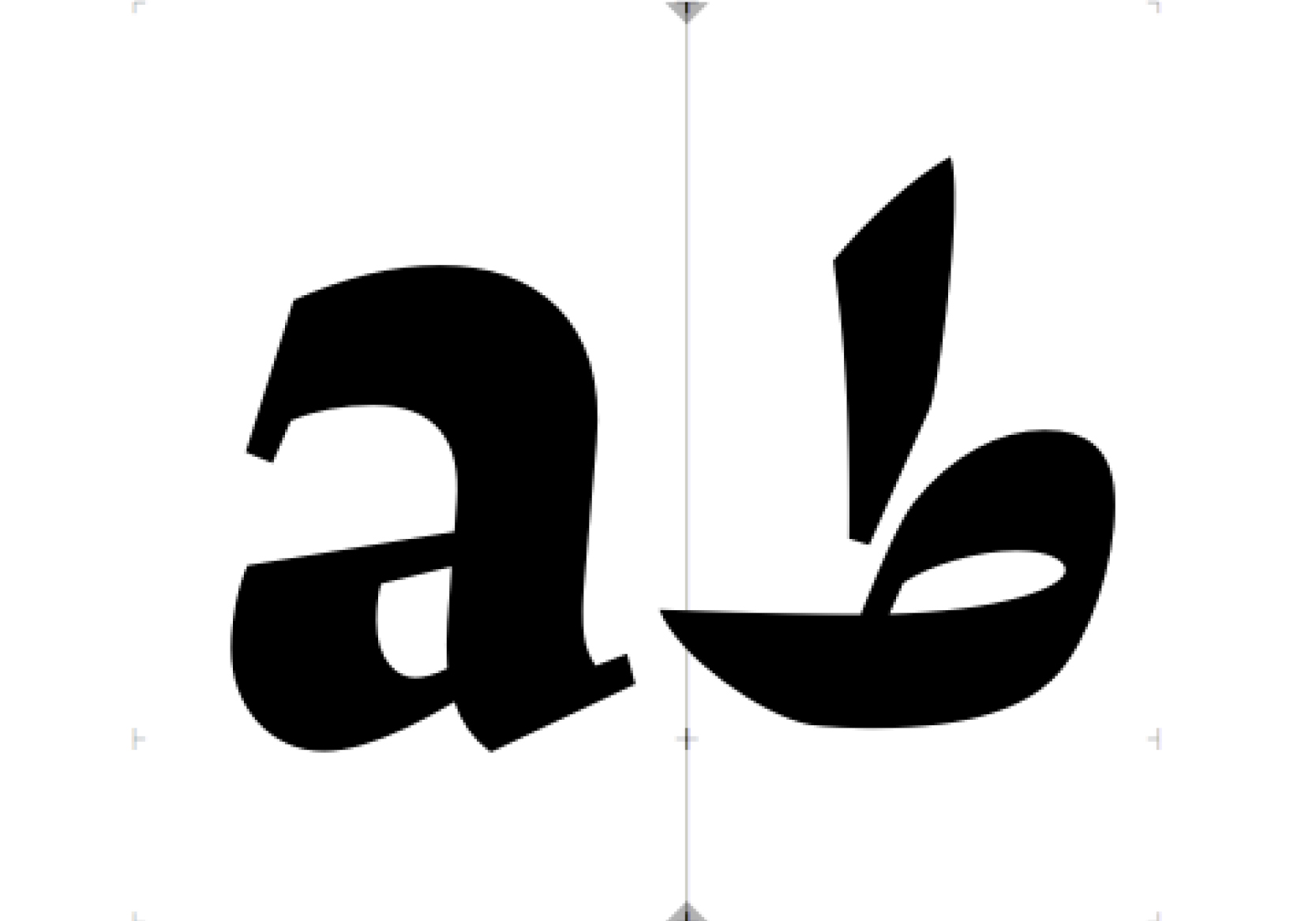
A lowercase a and a tah is where I started the design of each script.