Best and worst of calligraphy
One of the first steps in acclimating to a new script and understanding its letterforms is practicing its writing. I went about this in a few different ways: neutral calligraphy writing exercises, emulating lettering samples using calligraphy tools, and bending calligraphy to my will in order to reinforce shapes I liked.
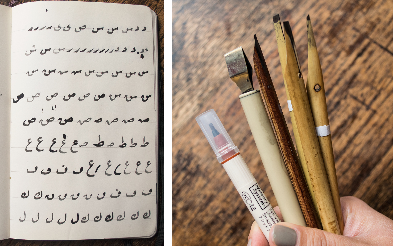
Before I did anything, as a wee Ruq’ah fan, I just tried to learn writing in Arabic with Ruq’ah in a formal way. With a reed pen and lined pages in my Moleskine, I practiced the strokes and letters I found in T.F. Mitchell’s book.
 The tools and the results.
I learned very quickly that the proportions of the isolated forms of ayn and jeem, for example, would not reveal themselves easily. In fact, these letters would become some of the most challenging as I later began draw larger characters.
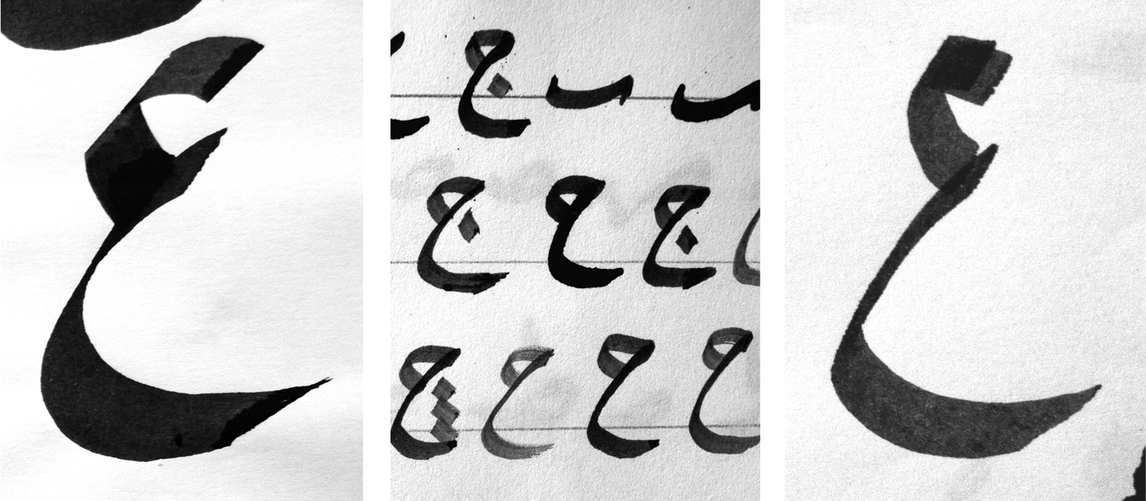 From left to right (and best to worst): Automatic Pen on paper, reed pen on [sketchbook] paper, calligraphy marker on paper.
As I became more familiar with the calligraphic movements and could make my way around at least an isolated beh, I wanted to see some of these shapes larger, with thicker, more robust strokes. At first I tried to tackle these with Latin-oriented calligraphy markers. The result was less than ideal, and it only highlighted my tenuous grasp on proportions.
Later I tried a bamboo pen that I believe was cut and more suited for Indic calligraphy. The results were… okay. I couldn’t maintain a steady distribution of ink and had to dip back a few times to complete the stroke.
I finally landed on a Automatic Pen (and black calligraphy ink) as the best and most convenient tool to explore Ruq’ah’s forms in a large format. Unlike the reed pen, which by its relatively small nature tends to blur contrast and corners (at least it did in my case), the Automatic Pen is very useful in magnifying small details. This was helpful in understanding proportions, and it also helped me decide later on what attributes I could apply to the strictly calligraphic strokes in order to make the letterforms more typographic.
The Automatic Pen also glides more smoothly with ink; this helps concentrate on the shape one is trying to make as opposed to being distracted by the breaks in continuity of stroke and the mismatch of textures — not that I don’t love the screech of a reed nib against the paper, but in unqualified hands it can be more destructive than productive.
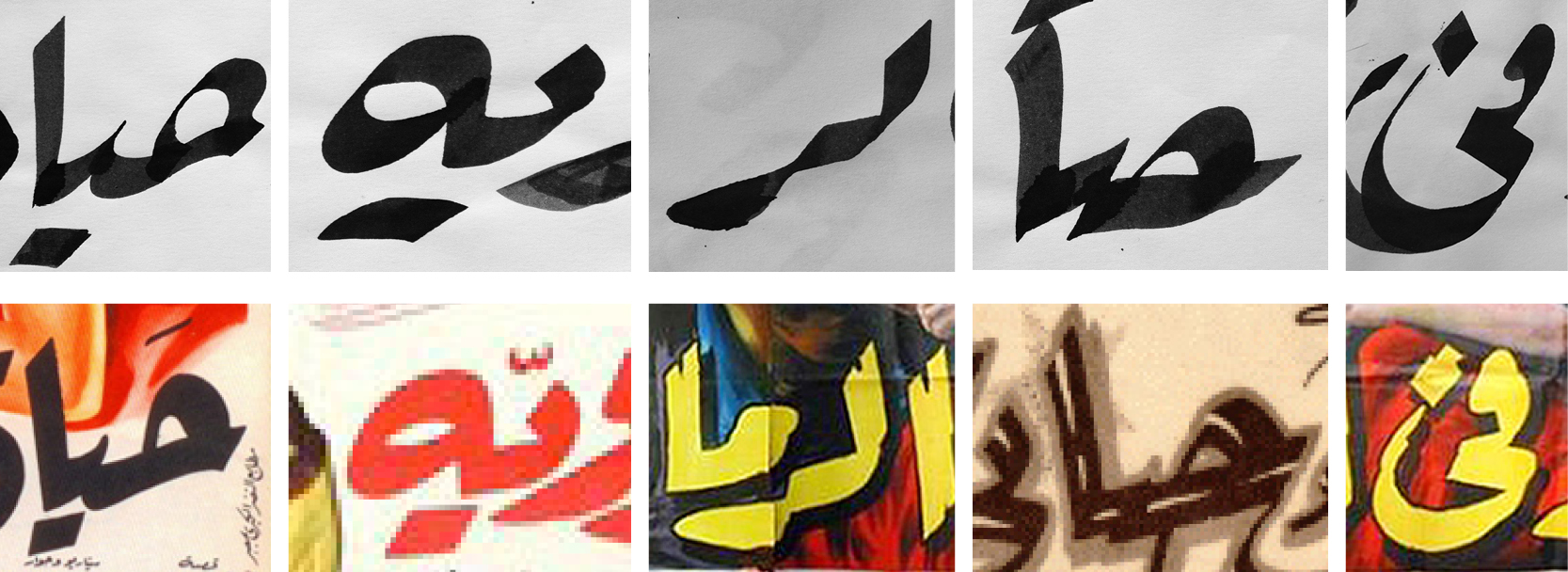 On top, the calligraphic results; on the bottom the lettering references. Bottom images via Ebay.
Armed with my steel pen and large sheets of paper this time, I started to recreate certain strings I saw in the lettering samples I was perusing. This was a good introduction into not only how different stroke structures contribute to different lettering styles, but also how letter combinations connect to or stack on each other in said styles.
At last, I had done enough to find some fortuitous flukes that could lead the way in finding my version of Ruq’ah. Next up: Sketching!